Our colours
Our colour palette is made from a total of 15 colours, offering a flexible yet consistent approach.
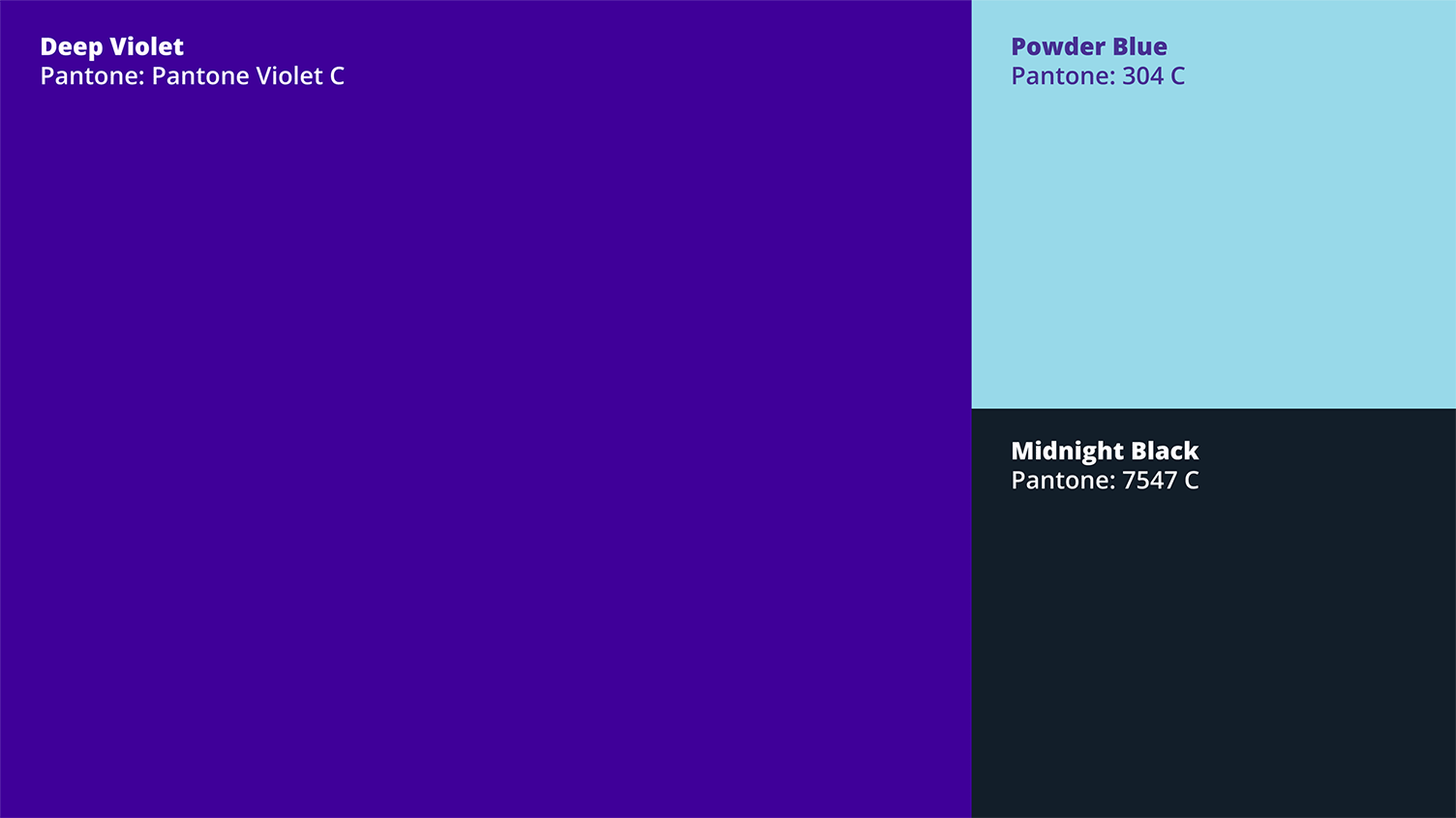
Our core colours
Our 3 core colours are: deep violet, powder blue and midnight black.
Deep violet is used in our logo and is the common thread across our communications.
Our colours do not have to be applied in large blocks. This can sometimes become overpowering. Using our colour palette as accents on a white or neutral base is encouraged.
Colour codes
| Colour name | Pantone | RGB | Hex | CMYK |
|---|---|---|---|---|
| Deep violet | Pantone Violet C | 68 0 153 | 440099 | 90 99 0 0 |
| Powder blue | 304 C | 154 219 232 | 9ADBE8 | 34 0 6 0 |
| Midnight black | 7547 C | 19 30 41 | 131E29 | 99 74 31 84 |
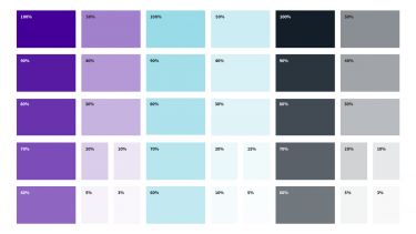
Tints
For flexibility, deep violet, powder blue and midnight black can be applied using tints.
- Tinted hex colour codes
-
Deep violet Powder blue Midnight black 100% 440099 9ADBE8 131E29 90% 5719A3 A4DFEA 2B353E 80% 6933AD AEE2ED 424B54 70% 7C4DB8 B8E6EF 5A6269 60% 8F66C2 C2E9F1 71787F 50% A280CC CDEDF3 898F94 40% B499D6 D7F1F6 A1A5A9 30% C7B3E0 E1F4F8 B8BBBF 20% DACCEB EBF8FA D0D2D4 15% F0FAFC 10% ECE6F5 F5FBFD E7E9EA 5% F6F2FA FAFDFE F3F4F4 3% F9F7FC F8F8F9
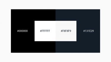
Off-white backgrounds
In digital applications, it is good practice to use an off-white background colour. This will help minimise eye strain and create a better reading experience for people with dyslexia.
Depending on the content, a 3%, 5% or 10% tint of our core colours can be used.
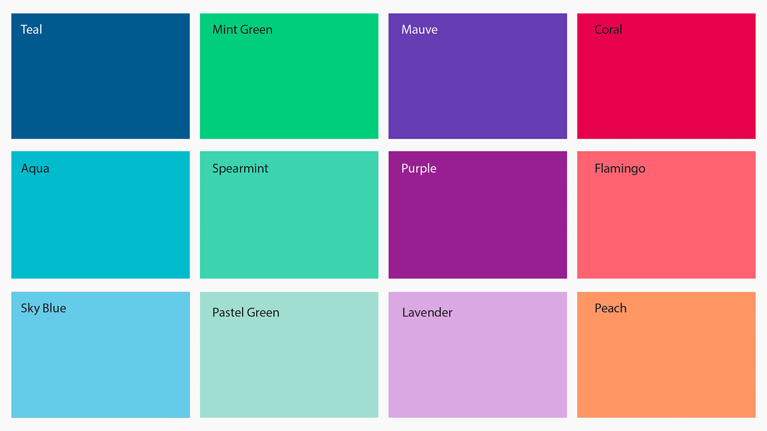
Our wider colour palette
Our wider palette is made up of 12 colours, named below. These can act as a lead colour with the violet appearing as an accent colour. This helps us to create a flexible yet consistent approach.
Colour codes
| Colour name | RGB | Hex | CMYK |
|---|---|---|---|
| Teal | 0 90 143 | 005A8F | 100 19 10 30 |
| Aqua | 0 187 204 | 00BBCC | 97 0 30 0 |
| Sky blue | 100 203 232 | 64CBE8 | 54 0 6 0 |
| Mint green | 0 206 124 | 00CE7C | 57 0 62 0 |
| Spearmint | 59 212 174 | 3BD4AE | 43 0 38 0 |
| Pastel green | 161 222 210 | A1DED2 | 21 0 17 0 |
| Mauve | 102 61 179 | 663DB3 | 70 76 0 0 |
| Purple | 152 31 146 | 981F92 | 26 90 0 0 |
| Lavender | 218 168 226 | DAA8E2 | 13 33 0 0 |
| Coral | 231 0 76 | E7004C | 0 97 50 0 |
| Flamingo | 255 99 113 | FF6371 | 0 82 53 0 |
| Peach | 255 150 100 | FF9664 | 0 47 80 0 |
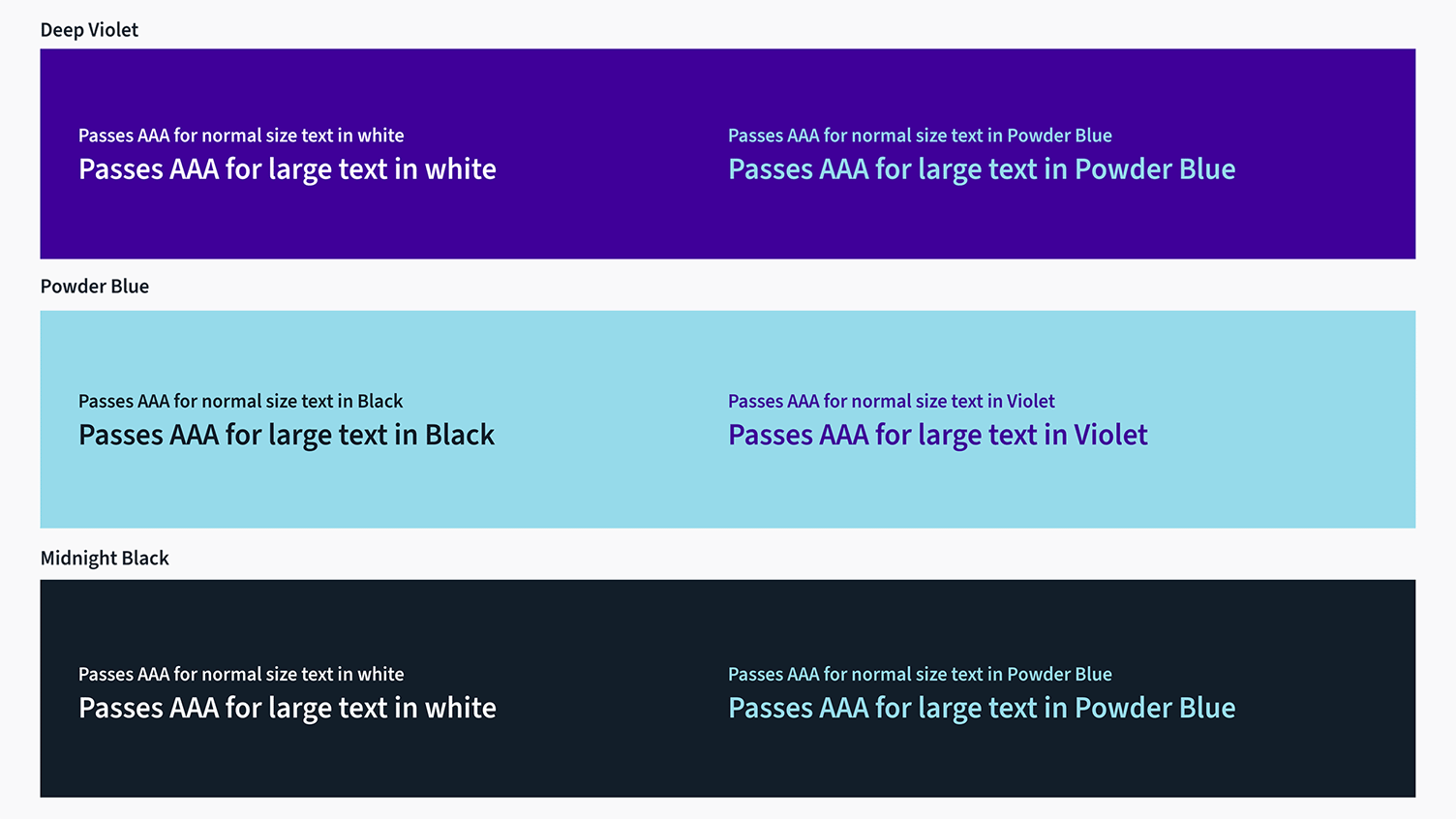
Accessibility
When typesetting, colour contrast must be taken into consideration. This is especially important for people with a visual impairment.
Text should be written in violet or midnight black.
Powder blue can be used as a text colour on a violet or midnight black background.
Reversed white text can only be used as set out in the guidance below.
The guidance below shows what combinations meet either AA or AAA levels of accessibility according to Web Content Accessibility Guidelines (WCAG).
Eye strain
Using pure black and white colour combinations in digital design can cause eye strain due to their high contrast. Using softer shades such as midnight black and a low percentage tint of midnight black will help to reduce eye strain. This advice is specific to digital screens and does not apply to print.