
Our logo
Our logo contains a modified version of our original 1905 coat of arms and our name set in Source Serif Pro.
Our primary logo

For the vast majority of applications, the primary logo should be used in violet. It is also available in midnight black and white.
Only use the master artwork, never redraw or reconfigure this file.
Our portrait logo

This option has been designed for circumstances where the primary logo may not fit into a given space comfortably or where the primary logo lacks visual impact, specifically at very small sizes on digital adverts and alongside partner logos. The portrait logo must not take preference over the primary logo.
Please contact marketing@sheffield.ac.uk to use this version.
Using the logo

Only our violet, midnight black or white logo should be used. When deciding which logo to use it is important to consider the background it will be placed on. You should choose a logo which will contrast with the background colour and is legible. The white outline logos are only for use on dark backgrounds. The filled logos are for use on lighter backgrounds. The logo does not need to be placed on a white or coloured background box.
Exclusion zone
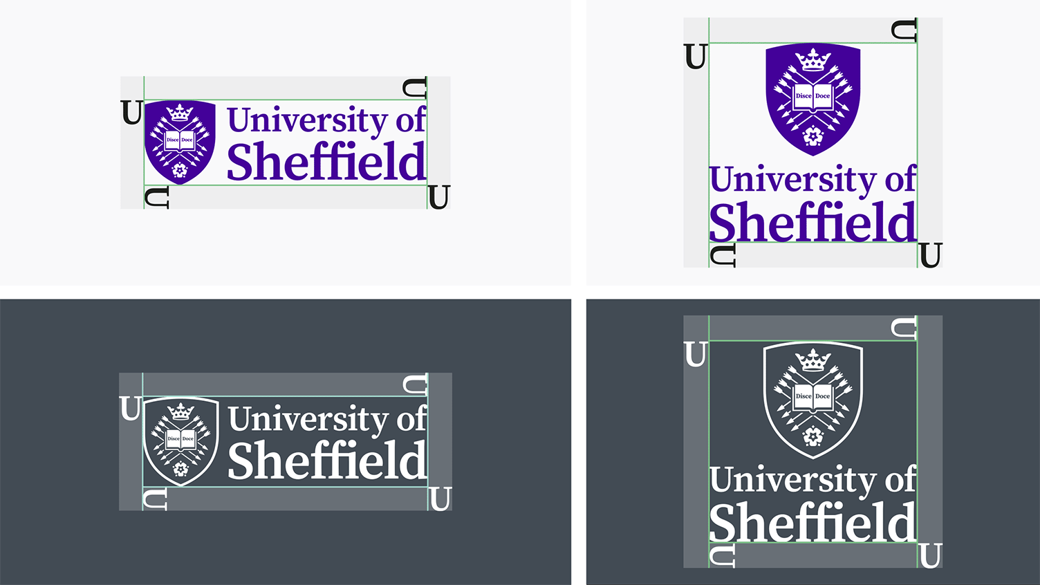
In order to maintain the logos visibility we protect it by using an exclusion zone. The exclusion zone is an area of clear space surrounding the logo where no competing graphic elements are allowed. A competing graphic element could be another logo, some text, an icon, or an illustration.
The size of the exclusion zone is determined by the width of the letter 'U'.
Logo sizing
To help maintain visibility, we have a minimum logo size in place.
The minimum size of our primary logo is 35mm. The minimum size of the portrait logo is 25mm. These sizes are measured using the width of the given logo.
Logo placement

The logo can be placed in different areas depending on which application it is used on.
The default position is the top left, especially for digital use. The top right can be used where appropriate. The bottom left or right can be used when the brand is of a secondary concern or as part of a lock up.
Whatever the chosen alignment, the logo should be positioned within the margins and never flush against the edge of the artwork.
Incorrect logo use
Applying the logo correctly is the first step in making the most of our brand. It is important to always use the source logo files.
- Do not invert or fill the logo.
- Do not change the colour of the logo. Only use the colours provided.
- Do not stretch the logo. The logo should be scaled in proportion.
- Do not use low quality logos. Ensure you download the correct version for use in print or web.
- Do not alter the relationship of the elements within the logo.
- Do not use the logo text or shield in isolation from each other.
If in doubt contact marketing@sheffield.ac.uk
Brand architecture
All entities wholly owned by the University should follow the University of Sheffield standard approach to brand architecture as set out below.
As the evolved identity is rolled out this will require some existing entities to move to the standard approach. This will be a gradual process and support will be provided. The central marketing team will contact those affected and anyone unsure about how their area might be affected should contact marketing@sheffield.ac.uk
University of Sheffield standard approach
Brand extensions use the master brand identity (The University of Sheffield) and visually align themselves using the standard brand identity.
Core architectural principles:
- Presents the full University logo on left hand side with the brand extension on the right, separated by piping
- The brand extension adopts elements of the master brand's identity, eg colour and typeface
- The brand extension is written over a maximum of 3 lines
- Ampersands are used rather than ‘and’
- Where there are two brand extensions, such as a facility and an institute, one extension can be placed underneath
Areas that follow this approach
- Academic departments
- Faculties
- Professional Services departments
- Student Services
- University platforms/systems eg University of Sheffield Player
- Research institutes, centres and groups
In addition to the core architecture, the following principles are applied:
Department (Academic, Professional Services & Faculty) architectural principles:
- The department adopts the primary violet colour as a default. Black and white versions are available to use when necessary.
- Titlecase, Source Serif Pro font


Services and University platforms / systems
- The service or platform adopts any colour from the primary or secondary colour palette
- As standard, titlecase should be used. Source Sans Pro or Source Serif Pro font may be used


Research institutes, centres and groups
For any new or refreshed entities:
- University entity adopts midnight black
- Research entity may adopt a colour from the primary or secondary colour palette. Accessibility should be taken into account.
- As standard, titlecase should be used. Source Sans Pro or Source Serif Pro font may be used
- Capital letters are acceptable for acronyms and initialisms
- Graphical devices can be considered if naming only is unsuitable


Non Standard approaches
There are limited exceptions to the standard approach. Any exceptions must be agreed with Corporate Communications and where required UEB.
Partner logos
When positioning a partner’s logo alongside our own the primary logo lockup should always be your first option. Where the primary logo lockup is not appropriate, alternative approaches include using the portrait version of our logo and using a monochrome version. They are designed to ensure that our logo appears equal to its counterpart.
Partnerships should be handled with care and reflect an official relationship with an external organisation.
If you are unsure what approach to take then contact marketing@sheffield.ac.uk
