
Our typeface
With accessibility in mind, our fonts help us establish a consistent identity throughout all our communications.
Our typeface
Source is our chosen typeface family. This consists of Source Sans and Source Serif. This typeface has been chosen with inclusivity in mind. It allows us to communicate clearly and confidently, retaining elements of prestige and tradition, whilst being versatile enough to meet the needs of our audiences.
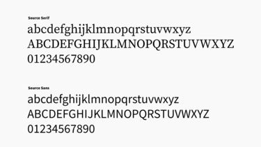
Our fonts fall under the SIL Open Source Licence and can be used freely. Source Han Sans Simplified Chinese is available to download from Adobe Fonts and can only be used on Adobe and Microsoft applications.
Using our typeface
It is essential to consider the accessibility of our fonts when using them. The Source family can be utilised in a variety of ways, providing flexibility while keeping overall consistency.
Only the typefaces Source Sans and Source Serif should be used in the following weights: Extra Light, Light, Regular SemiBold, Bold and Black. Care should be taken using Extra Light and Light at small sizes to ensure legibility.
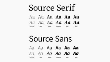
Where possible body copy should not be used below 11pt
Font hierarchy
Our font hierarchy should help the reader to identify and navigate the structure of our written content. While it is important to note that type hierarchy is a variable process based on the context of the design, headings, subheadings and body text can use size, weight and colour to provide a system which allows our audiences to easily navigate the content provided. While not a linear process, some general rules for establishing a clear hierarchy within our visual communications are recommended:
| Format | Source Sans | Source Serif |
|---|---|---|
| Headings | Weight: Black | Weight: Black |
| Subheadings | Weight: Semibold | Weight: Semibold or Normal |
| Body | Weight: Normal | Weight: Normal |
Leading, tracking and kerning
In the majority of cases, the leading, tracking and kerning of our fonts will not need to change. Designers may wish to consider the following points where relevant:
Leading
Leading can remain defaulted especially in body copy. For optimum clarity designers may interpret what looks best for the design. For best practice, leading should be 3pts larger than the font size used. For instance, 12pt font sizing should have 15pt leading. In some cases where larger typography is used, such as in headings, the leading may need to decrease below the +3pt system. Legibility and accessibility should remain the priority.
Tracking
Tracking can be left at 0. When our fonts are used at smaller sizes, we recommend increasing the tracking 1.2x from the font size. This would mean a 12pt font size would have 14pt tracking. Please be aware that these are general recommendations and tracking may require adjustments depending on the application.
Kerning
When using Source Serif in a large point size, optical kerning may be used where necessary. This can help provide greater consistency between the spacing of each character, improving clarity and legibility.